The importance of color in design cannot be overstated. It is always the first thing people notice and the last thing they forget. A well-chosen color palette can make a design stand out, deliver a specific message, or evoke particular feelings, which makes it a critical element in the success of any fashion item.
For a T-shirt, one of the most frequently used wardrobe items, branding, or artistic statements, understanding and applying color theory effectively can transform a basic piece of clothing into a powerful form of communication.
Briefly About Color Theory
Color theory is a fundamental aspect of design and art, guiding the use of color to achieve aesthetic and functional harmony. At its core, color theory is the science and art of using color, encompassing the principles and guidelines that dictate how colors interact, how they are perceived, and how they can be combined to create visually appealing and effective designs.
The Basics of Color Theory
The color wheel and color harmony are some of the fundamental ideas upon which color theory is based on. The color wheel, for one to note, is a circular graphic that was created by Sir Isaac Newton in 1666 to represent the relationships between primary, secondary, and tertiary colors.
Primary Colors: The primary colors are red, blue, and yellow. These colors cannot be created by mixing other colors and serve as the foundation for creating all other colors.
Secondary Colors: By mixing two primary colors, secondary colors are formed. These include green (blue + yellow), orange (red + yellow), and purple (red + blue).
Tertiary Colors: Tertiary colors are created by mixing a primary color with a neighboring secondary color on the color wheel. Examples include red-orange, yellow-green, and blue-purple.
Color Harmony
Color harmony refers to the aesthetically pleasing arrangement of colors. It is about creating a sense of order and balance that is visually appealing and satisfying. There are several established color harmonies that designers use to create cohesive and attractive designs:
Complementary Colors: These are colors located opposite each other on the color wheel, such as red and green or blue and orange. Complementary colors create a high contrast and vibrant look, making designs stand out.
Analogous Colors: These are colors that are next to each other on the color wheel, like blue, blue-green, and green. Analogous colors typically match well and create serene and comfortable designs.
Triadic Colors: A triadic color scheme uses three colors that are evenly spaced around the color wheel, such as red, yellow, and blue. This scheme offers a high contrast while maintaining harmony and balance.
Split-Complementary Colors: This scheme is a variation of the complementary color scheme. In addition to the base color, it uses the two colors adjacent to its complement. This provides high contrast while avoiding the tension of a direct complementary scheme.
Tetradic Colors: Also known as a double-complementary scheme, this uses four colors arranged into two complementary pairs. This rich color scheme offers plenty of possibilities for color variation and is the most versatile.
Monochromatic Colors: This scheme uses variations in lightness and saturation of a single color. This can create a very cohesive and harmonious look, but it may lack the contrast of the other schemes.
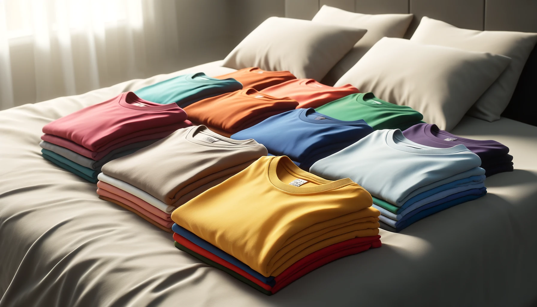
The Value of Colors in T-Shirt Design
T-shirts are more than just basic clothing items; they are canvases for self-expression, marketing tools, and mediums for art, too. One of the most critical elements that contribute to the effectiveness and appeal of T-shirt design is color. The strategic use of color can significantly enhance the value of a T-shirt, influencing not only its aesthetic appeal but also its marketability and emotional impact on consumers.
Color as a Tool for Self-Expression
T-shirts are often used to convey personal beliefs, affiliations, and identities. Color plays a pivotal role in this form of self-expression. For instance, a person might choose a black T-shirt to project a sense of sophistication or a rebellious attitude, while another might opt for a bright yellow T-shirt to express cheerfulness and positivity. Designers leverage these associations to create T-shirts that resonate with specific target audiences.
Branding and Identity
For businesses, T-shirts are powerful branding tools. The colors used in a T-shirt design can strengthen brand identity and enhance brand recognition. Companies often choose colors that align with their brand's color scheme, reinforcing their brand's image and making their products instantly recognizable. For example, a company with a blue logo might design T-shirts that incorporate various shades of blue to maintain visual consistency.
Furthermore, colors can be used to differentiate products and create a unique brand personality. For instance, a sustainable clothing brand might use earth tones like green and brown to emphasize its commitment to the environment. In contrast, a tech-focused brand might use sleek, modern colors like black, white, and silver to convey innovation and sophistication.
Marketability and Consumer Preferences
The choice of colors in T-shirt design can have a direct impact on a product's marketability. Different colors appeal to different demographic groups. For instance, studies have shown that younger audiences tend to prefer vibrant and bold colors, while older consumers might gravitate towards more subdued and classic tones.
Seasonal trends also play a significant role in color selection. For example, bright and pastel colors are often associated with spring and summer collections, while darker, richer hues are popular in fall and winter. Keeping up with these seasonal trends ensures that the T-shirt designs remain relevant and appealing throughout the year. Additionally, incorporating trending colors can boost a product's appeal, as consumers are often drawn to what's currently fashionable.
Differentiation in a Crowded Market
Unique and creative use of color can differentiate a brand's products from the competition. Designers can experiment with unconventional color combinations and innovative uses of color to create distinct and memorable designs. This differentiation can be a key factor in attracting and retaining customers, as unique designs are more likely to leave a lasting impression.
For instance, a brand that consistently uses bold, unexpected color combinations might develop a reputation for being edgy and innovative. This can attract consumers who are looking for something different from the mainstream. On the other hand, a brand that uses a consistent, signature color scheme might become known for its cohesive and recognizable style, building brand loyalty among its customers.
The Most Popular Color Combinations in T-Shirt Designs in 2024
Earth Tones and Neutrals
The trend of sustainability and a return to nature continues to influence fashion in 2024. Colors such as olive green, terracotta, beige, and taupe are being paired together to create understated yet sophisticated looks. These combinations evoke a sense of calm and connection to nature, appealing to consumers who prioritize eco-friendliness and minimalism in their fashion choices.
Bold and Bright Pairings
This trend is characterized by high-energy, vibrant colors that capture attention and exude confidence. Think electric blue with neon green, fiery red with bright yellow, or hot pink with bold purple. These combinations are perfect for making a statement and are often used in streetwear and activewear to create dynamic and youthful designs.
Retro Color Palettes
Nostalgia continues to play a significant role in fashion. Inspired by the vibrant and eclectic colors of the 70s, 80s, and 90s, these combinations evoke a sense of fun and nostalgia. Popular retro palettes include mustard yellow with burnt orange, teal with magenta, and bright red with cobalt blue.
Contrasting Colors with Black or White
Using black or white as a base color with contrasting vibrant colors is a trend that continues to gain popularity in 2024. For example, a white T-shirt with bold red graphics or a black T-shirt with neon accents can create a powerful visual impact. This trend is particularly effective in designs that aim to highlight specific elements, such as logos, typography, or intricate graphics.
Soft Neons
Colors like neon pink, neon green, and neon blue are being toned down slightly to create softer, more wearable hues. These colors maintain the energetic feel of neon but with a more approachable and versatile look. A T-shirt design featuring soft neon colors can appeal to those who want to embrace bold hues without the full intensity of traditional neon.
T-shirt design is all about pushing the boundaries of color when one stays true to timeless principles. This year, the color combinations in vogue cater to a wide range of tastes and preferences. So, let us explore how color work and utilize this knowledge with confidence.